
Allianz Partners: redesigning embedded travel insurance offers across airline and lodging booking flows to improve clarity, trust, and conversion.
OVERVIEW
Allianz’s airline and lodging partners offer travel insurance as an add-on during the booking process. Over the course of my internship, I redesigned the visual treatment and layout of offers across Iberia, Aer Lingus, and Marriott to make them more appealing, easier to digest, and more effective in converting users.
ROLE
UX/UI Designer
TEAM
Solo Designer
TYPE & TIMELINE
10 week Internship
Summer 2025
TOOLS
Figma
OBJECTIVE
The end goal with the offer redesign is to increase user engagement and conversion for travel insurance by improving clarity, visual hierarchy, and trust.
WHERE THIS APPEARS
This offer is embedded in the booking path, after booking selection and before payment. It needs to be easy to digest quickly without disrupting the flow of booking or causing users to abandon the purchase.
THINGS TO THINK ABOUT
Clarity: What’s included in the insurance? Make it easy to scan and understand.
Trust: Reinforce credibility with visual cues (logos, social proof, “Recommended” messaging)
Visual hierarchy: What’s the first thing you notice when you look at the offer?
Compliance: What are the non-negotiables for the offer in this country? (For instance, in the US, the offer must include the Terms and Conditions copy at the bottom AND this copy must be within 3 point sizes of the body copy in the offer.)
Brand alignment: It should feel like it fits within the booking path for each partner and should align with the respective design system.
Allianz Partners: redesigning embedded travel insurance offers across airline and lodging booking flows to improve clarity, trust, and conversion.
OVERVIEW
Allianz’s airline and lodging partners offer travel insurance as an add-on during the booking process. Over the course of my internship, I redesigned the visual treatment and layout of offers across Iberia, Aer Lingus, and Marriott to make them more appealing, easier to digest, and more effective in converting users.
TYPE & TIMELINE
10 week Internship
Summer 2025
ROLE
UX/UI Designer
TOOLS
Figma
TEAM
Solo Designer
Allianz Partners is a world leader in B2B2C insurance and assistance, offering global solutions that span international health and life, travel insurance, automotive and assistance.
OVERVIEW
Nightlife should be fun, exciting, and safe, but for many women, LGBTQ+ individuals, and newcomers, it often feels daunting. Navigating nightlife without reliable safety information can lead to anxiety and missed opportunities for connection. That’s where Vibe Check comes in — a Y2K-inspired safety app that provides real-time safety ratings, live alerts, and community-driven tools to empower nightlife enthusiasts to explore confidently and connect meaningfully. Vibe Check transforms nightlife into a safer and more enjoyable experience for everyone.
ROLE
UX/UI Design
TYPE & TIMELINE
10 week Internship
Summer 2025
TOOLS
Figma
Photoshop
Illustrator
Canva
TEAM
Zofia Farley
Sandra Sanchez
Olivia Koerner
Alyssa Black
OBJECTIVE
The end goal with the offer redesign is to increase user engagement and conversion for travel insurance by improving clarity, visual hierarchy, and trust.
WHERE THIS APPEARS
This offer is embedded in the booking path, after booking selection and before payment. It needs to be easy to digest quickly without disrupting the flow of booking or causing users to abandon the purchase.
THINGS TO THINK ABOUT
Clarity: What’s included in the insurance? Make it easy to scan and understand.
Trust: Reinforce credibility with visual cues (logos, social proof, “Recommended” messaging)
Visual hierarchy: What’s the first thing you notice when you look at the offer?
Compliance: What are the non-negotiables for the offer in this country? (For instance, in the US, the offer must include the Terms and Conditions copy at the bottom AND this copy must be within 3 point sizes of the body copy in the offer.)
Brand alignment: It should feel like it fits within the booking path for each partner and should align with the respective design system.


FINAL OUTCOME
Zooming in on the offer.
Breaking the offer into smaller, more manageable sections reduced cognitive load and made the experience easier to scan and understand. This approach supported clearer decision-making, improved interaction, and helped create a more intuitive and confidence-building experience that better supports user engagement and conversion.

DESIGN PROCESS
DESIGN PROCESS
PARTNER FIGMA FILES
Understanding patterns across partners and markets.
Reviewed and analyzed Figma files across multiple partners to understand different approaches to offer design, file organization, and component structure. Compared how layouts, hierarchy, and components were adapted for different audiences and markets, identifying patterns that supported clarity, scalability, and efficient iteration.


OPTIMIZATION RESULTS
Learning from real-world performance.
Reviewed optimization results across partners, focusing on what differentiated Champion offers from Challenger offers. Identified recurring patterns, unexpected outcomes, and design changes that meaningfully impacted clarity, visual hierarchy, and user response.
WEBSITE AUDIT
Understanding brand context and UX patterns.
Conducted visual audits of partner websites by capturing and annotating screenshots to identify key UX patterns, visual hierarchy, and interaction cues. Reviewed elements such as layout, component behavior, and interaction states, including hover effects and animations, to understand how each brand communicates trust and clarity. These insights helped identify opportunities for improvement and ensured the offer design aligned with existing user expectations across each brand’s experience.
INTERNSHIP FINAL PRESENTATION
Synthesizing research, iteration, and design decisions.
Created and delivered a final presentation summarizing my internship work, including research, design exploration, partner-specific constraints, and key UX learnings. The presentation highlights how patterns, accessibility, and offer structure evolved across partners and markets, demonstrating my ability to synthesize complex work and clearly communicate design decisions to stakeholders.
Allianz Partners: redesigning embedded travel insurance offers across airline and lodging booking flows to improve clarity, trust, and conversion.
OVERVIEW
Allianz’s airline and lodging partners offer travel insurance as an add-on during the booking process. Over the course of my internship, I redesigned the visual treatment and layout of offers across Iberia, Aer Lingus, and Marriott to make them more appealing, easier to digest, and more effective in converting users.
TYPE & TIMELINE
10 week Internship
Summer 2025
ROLE
UX/UI Designer
TEAM
Solo Designer
TOOLS
Figma
OBJECTIVE
The end goal with the offer redesign is to increase user engagement and conversion for travel insurance by improving clarity, visual hierarchy, and trust.
THINGS TO THINK ABOUT
Clarity: What’s included in the insurance? Make it easy to scan and understand.
Trust: Reinforce credibility with visual cues (logos, social proof, “Recommended” messaging)
Visual hierarchy: What’s the first thing you notice when you look at the offer?
Compliance: What are the non-negotiables for the offer in this country? (For instance, in the US, the offer must include the Terms and Conditions copy at the bottom AND this copy must be within 3 point sizes of the body copy in the offer.)
Brand alignment: It should feel like it fits within the booking path for each partner and should align with the respective design system.
WHERE THIS APPEARS
This offer is embedded in the booking path, after booking selection and before payment. It needs to be easy to digest quickly without disrupting the flow of booking or causing users to abandon the purchase.

FINAL OUTCOME
Zooming in on the offer.
Breaking the offer into smaller, more manageable sections reduced cognitive load and made the experience easier to scan and understand. This approach supported clearer decision-making, improved interaction, and helped create a more intuitive and confidence-building experience that better supports user engagement and conversion.
Breaking the offer into smaller, more manageable sections reduced cognitive load and made the experience easier to scan and understand. This approach supported clearer decision-making, improved interaction, and helped create a more intuitive and confidence-building experience that better supports user engagement and conversion.


DESIGN PROCESS
PARTNER FIGMA FILES
Understanding patterns across partners and markets.
Reviewed and analyzed Figma files across multiple partners to understand different approaches to offer design, file organization, and component structure. Compared how layouts, hierarchy, and components were adapted for different audiences and markets, identifying patterns that supported clarity, scalability, and efficient iteration.
OPTIMIZATION RESULTS
Learning from real-world performance.
Reviewed optimization results across partners, focusing on what differentiated Champion offers from Challenger offers. Identified recurring patterns, unexpected outcomes, and design changes that meaningfully impacted clarity, visual hierarchy, and user response.
WEBSITE AUDIT
Understanding brand context and UX patterns.
Conducted visual audits of partner websites by capturing and annotating screenshots to identify key UX patterns, visual hierarchy, and interaction cues. Reviewed elements such as layout, component behavior, and interaction states, including hover effects and animations, to understand how each brand communicates trust and clarity. These insights helped identify opportunities for improvement and ensured the offer design aligned with existing user expectations across each brand’s experience.


INTERNSHIP FINAL PRESENTATION
Synthesizing research, iteration, and design decisions.
Created and delivered a final presentation summarizing my internship work, including research, design exploration, partner-specific constraints, and key UX learnings. The presentation highlights how patterns, accessibility, and offer structure evolved across partners and markets, demonstrating my ability to synthesize complex work and clearly communicate design decisions to stakeholders.


REFLECTION
This project reinforced how impactful thoughtful UX decisions can be in high-intent, time-sensitive moments. Because the insurance offer appears late in the booking flow, when users are focused on completing a purchase, every design choice needed to prioritize clarity, trust, and speed without disrupting momentum.
Working within strict constraints such as compliance requirements, partner design systems, and limited user attention pushed me to rely heavily on proven design patterns and clear visual hierarchy. Using familiar patterns helped reduce cognitive load and made the offer feel intuitive and credible, which is especially important in travel insurance where users need to feel confident in their decision quickly.
Breaking the offer into smaller, more digestible sections was a key learning for me. This approach made complex information easier to scan and understand, both for users and for my own design process. Zooming in on individual components allowed for more focused iteration and resulted in an experience that felt clearer, more approachable, and easier to interact with, supporting stronger engagement and conversion.
Designing with accessibility in mind further strengthened the experience. Prioritizing readability, contrast, and hierarchy ensured the offer was usable by a wider range of users, reinforcing trust and demonstrating how inclusive design practices lead to better overall outcomes.
Finally, this internship emphasized the importance of strong digital workspace hygiene. Maintaining an organized and well-labeled Figma file was essential for rapid iteration and cross-team collaboration, helping reduce errors and enabling more efficient feedback cycles. Clear organization ultimately supported more consistent, high-quality design output.

Other projects
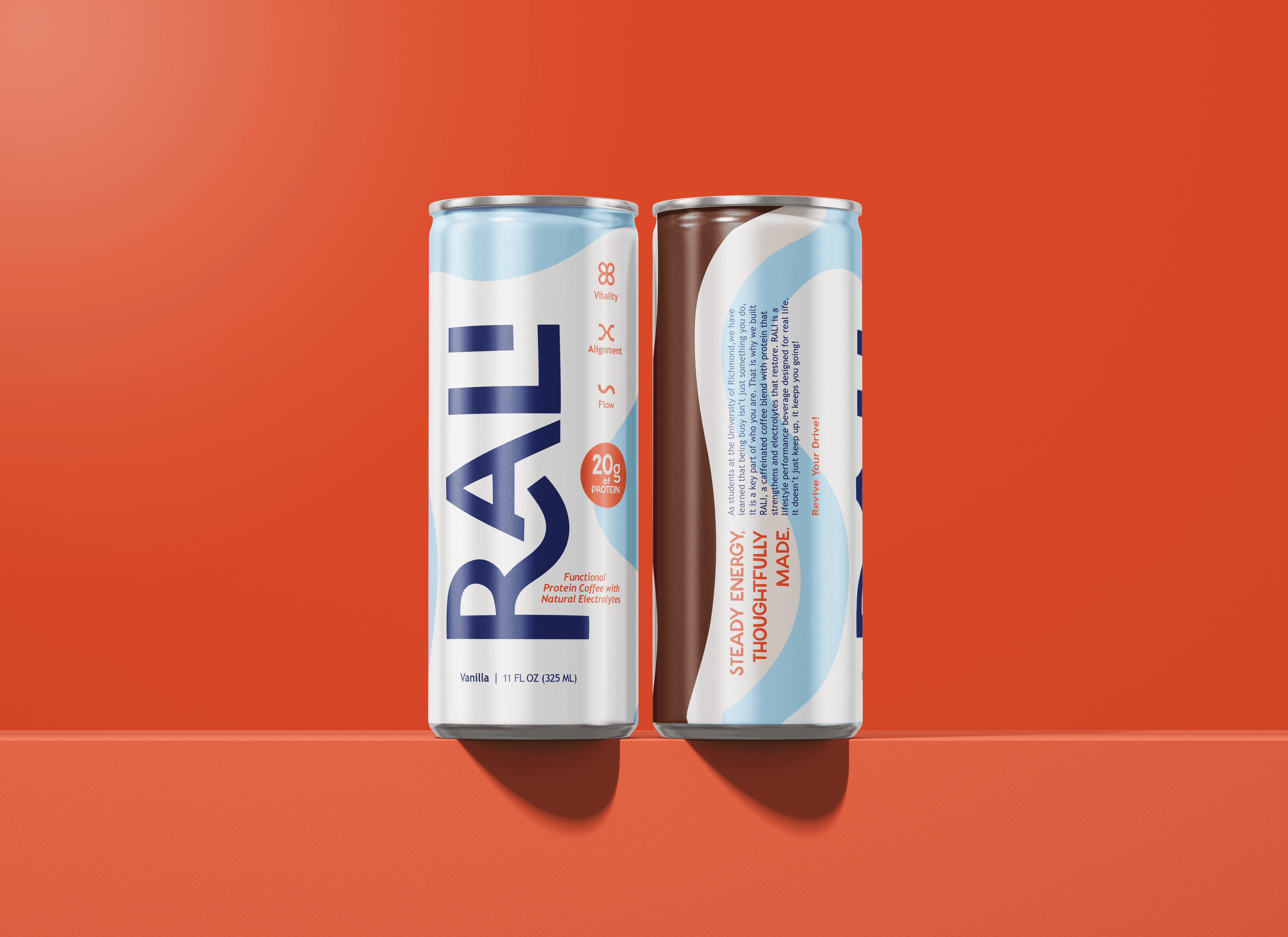
RALI
A protein coffee designed for sustained, functional energy.

West Realm
An AI-powered tool that helps customers visualize furniture in their own space, turning uncertainty into confident decisions.

Tamagotchi
The LoveLock Edition reimagines the iconic digital pet as a shared ritual designed to strengthen relationships through play.

Study Abroad Scrapbook
Capturing my semester in Florence through photography, memories, and thoughtful layout design.
REFLECTION
This project reinforced how impactful thoughtful UX decisions can be in high-intent, time-sensitive moments. Because the insurance offer appears late in the booking flow, when users are focused on completing a purchase, every design choice needed to prioritize clarity, trust, and speed without disrupting momentum.
Working within strict constraints such as compliance requirements, partner design systems, and limited user attention pushed me to rely heavily on proven design patterns and clear visual hierarchy. Using familiar patterns helped reduce cognitive load and made the offer feel intuitive and credible, which is especially important in travel insurance where users need to feel confident in their decision quickly.
Breaking the offer into smaller, more digestible sections was a key learning for me. This approach made complex information easier to scan and understand, both for users and for my own design process. Zooming in on individual components allowed for more focused iteration and resulted in an experience that felt clearer, more approachable, and easier to interact with, supporting stronger engagement and conversion.
Designing with accessibility in mind further strengthened the experience. Prioritizing readability, contrast, and hierarchy ensured the offer was usable by a wider range of users, reinforcing trust and demonstrating how inclusive design practices lead to better overall outcomes.
Finally, this internship emphasized the importance of strong digital workspace hygiene. Maintaining an organized and well-labeled Figma file was essential for rapid iteration and cross-team collaboration, helping reduce errors and enabling more efficient feedback cycles. Clear organization ultimately supported more consistent, high-quality design output.
Other projects
RALI
A protein coffee designed for sustained, functional energy.
West Realm
An AI-powered tool that helps customers visualize furniture in their own space, turning uncertainty into confident decisions.
Tamagotchi
The LoveLock Edition reimagines the iconic digital pet as a shared ritual designed to strengthen relationships through play.
Study Abroad Scrapbook
Capturing my semester in Florence through photography, memories, and thoughtful layout design.

